 Home prices are down in every Chicago neighborhood and suburb. We show you which areas have been hit the hardest in this down economy on Chicago Tonight at 7:00 pm.
Dennis Rodkin of Chicago magazine joins us to discuss the current state of real estate prices, as featured in the October issue of the magazine.
Here are some of the highlights:
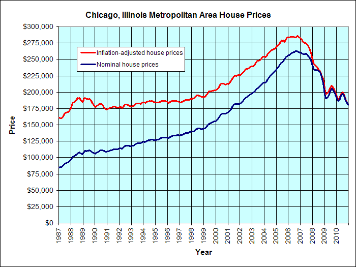
- Home values in the Chicago region are down approximately 31 percent from their September 2006 peak, according to the S&P/Case-Shiller Home Price Index.
- Of the 20 cities featured in S&P’s analysis, Chicago has the fourth worst percentage change at -6.6% from July 2010 to July 2011.
- On a national scale, the three cities with the largest percent change were Minneapolis, (-9.10%,) Phoenix, (-8.80%), and Portland, ( -8.40%.)
- Washington and Detroit were the only two cities with a positive percent change, D.C. at .35 and Detroit at 1.2%.
In both the city and the suburbs, Chicago’s areas with the largest drop in home values tended to be moderate-income communities, says Rodkin in the Chicago magazine article. However, the areas that held their value best differ: in the city, affluent neighborhoods experienced the smallest percentage drop, while in the suburbs, areas were mostly upper middle-class.
The areas with the largest drop in the city and suburbs are both named Riverdale. Suburban Riverdale is adjacent to the Far South Side Chicago neighborhood of Riverdale across the city limits.
In the city, the South Side contained four of the five neighborhoods with the largest percentage drops.
In the suburbs, most house prices in the suburbs peaked in 2006 or 2007. 27 of the 211 suburbs peaked slightly later, in 2008. In total, 30 of the suburban communities experienced a drop of 50 percent or larger.
The chart above estimates the market value of the median prices of Chicago's houses from 1987 until present. The red line represents inflation-adjusted house prices, and the blue line represents nominal prices.
For more information, visit the links below.

